 Author: Maria Nattestad, Scientific Visualization Lead
Introduction
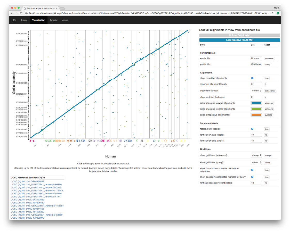
Next week, DNAnexus will be at the Plant and Animal Genome conference (PAG) in San Diego (booth 431). As part of an ongoing effort to expand our visualization capabilities, we will present an open-source tool called Dot that helps scientists visualize genome-genome alignments through a rich, interactive dot plot.
In addition to its scientific contribution, Dot encourages community development of new visualization tools by providing a template that can be used for new visualization tools in other areas of bioinformatics. This would allow bioinformaticians to focus on the bioinformatics and visualization without needing to master web programming intricacies such as reading data from local and remote servers, which is all handled by Dot’s modular and reusable inner workings.
Importance of Dot Plots
Constructing a genome assembly is fundamental to studying the biology of a species. In recent years, advances in long-read sequencing and scaffolding technologies have led to unprecedented quality and quantity of genome assemblies. Better reference genomes contribute to better gene annotations, evolutionary understanding, and biotech opportunities.
Comparing new assemblies to existing genomes of related species is crucial to understanding differences between organisms across the tree of life. Genome assemblies are never perfect and always have to be evaluated critically by comparing against other assemblies or reference genomes, whether of the same or a closely related species. Comparative genomics is also how assemblies of two species’ genomes can be compared and contrasted to look for features that represent functional differences or inform the study of their evolution.
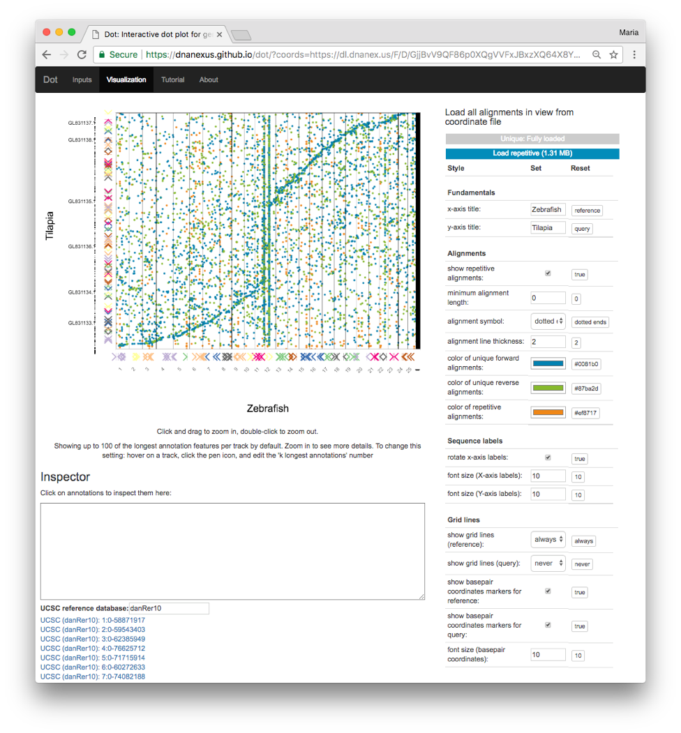
The classic method for visualizing genome-genome alignments is the dot plot, which provides an excellent overview of alignments from the perspective of both genomes. Dot plots place the reference genome on one axis and the query genome (that is aligned against the reference) on the other axis. Alignments between the two genomes are placed according to their coordinates on both genomes. Whereas genome browsers (such as IGV and the UCSC Genome Browser) plot data in one dimension on one genome, dot plots use two dimensions to show alignments in two genomes’ coordinates spaces simultaneously. This is necessary when representing large genome alignment data where the query coordinates matter just as much as the reference coordinates for a particular alignment.
However, dot plots have barely changed in the past decade and are still generated from the command-line as static images, limiting detailed investigation. We decided to tackle this problem as an open-source science project at DNAnexus.
Introducing Dot
Here we present Dot, an interactive dot plot viewer that allows genome scientists to visualize genome-genome alignments in order to evaluate new assemblies and perform exploratory comparative genomics.
Dot supports the output of MUMmer’s nucmer aligner the most commonly used software method for aligning genome assemblies. A quick script called DotPrep.py converts the delta file to a more streamlined coordinates file with an index that enables Dot to read in more alignments in certain regions on demand.
Interactivity and features
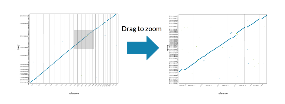
Dot adds a number of useful features on top of the classic dot plot concept. The index enables a quick plot of an overview that includes the longest 1000 alignments. From here, users can zoom in to look at particular regions and load all the alignments for regions of interest.
In addition to showing alignments, Dot allows scientists to load annotations for either or both genomes to show additional context (e.g. understanding how sequence differences map to gene differences). Annotation tracks are a common feature of one-dimensional genome browsers, but to translate this concept to the two-dimensional dot plot, we enable annotation tracks on both axes. This is a major benefit of Dot that makes it possible to compare gene annotations visually alongside the alignments of the DNA sequences.
Moreover, users can jump to the same region of the reference genome in the UCSC Genome Browser to quickly see additional context for a region of interest. This allows scientists to explore how known repetitive elements in the reference genome could potentially affect assembly quality in specific regions.
Details for developers
By leveraging D3 and canvas in JavaScript, Dot combines the benefits of interactivity with scalability, enabling scientists to explore large genomes. The UI on the right side panel is built using an open-source SuperUI.js [https://github.com/marianattestad/superui] plugin, and the input handling and basic page navigation is set up through a special VisToolTemplate [https://github.com/MariaNattestad/VisToolTemplate] plugin we developed to enable others to create new visualization tools more easily. We encourage developers to utilize and build on Dot and these open-source projects to create their own visualization tools. Dot is very modular and can be used as a template to build new visualization tools. The template handles complex and necessary components like reading input data files from various sources, thereby letting developers focus only on the visualization itself.
Dot is open source
Dot is free to use online at [https://dnanexus.github.io/dot/] and open source at [https://github.com/dnanexus/dot]. For DNAnexus users, there is a package available among the featured projects with (1) an applet for running MUMmer’s nucmer aligner that includes DotPrep.py, (2) a shortcut to Dot to send files from DNAnexus quickly, and (3) example data and results.


.png)
.png)
.png)